Presentation
The VRUI library is based on the Android Layout System
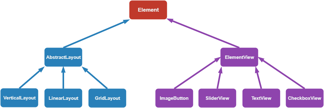
An element contains style attributes (width, height, padding, ...). It also contains user defined callbacks, triggered when special actions happen (cursor is hover the element, ...).
You should never directly instanciate an AbstractLayout. It allows to deal with hierarchy.
VerticalLayout allows to position element next to each other, going downward by default. You can customize other properties, such as the vertical space between elements, etc...
Just like the VerticalLayout, the HorizontalLayout positions the element, but from left to right by default. You can also customize the space between elements.
This layout will put the element in a grid, and will be in charge of padding them, allocate them enough space, according to the number of rows and columns you asked.
This view is in charge of dealing with its content. It is here to handle padding and events on view. It is used to avoid replicate the code relative to events and style.
Simple button with an image at the middle. The button is divided into the background part and the icon part. Pressing / Releasing the button will trigger an onChange callback with the state of the button.
Slider with user defined bounds. You can drag it and it will update its internal values. Dragging it will trigger the onChange callback with the value of the slider.
Text element. You can change the string whenever you want, as well as its color.
The checkbox is divided into two parts, the background (the texture when it is empty), and the check, the texture when it is check. By default, it does not hide the background, but position the check texture in front of it.