

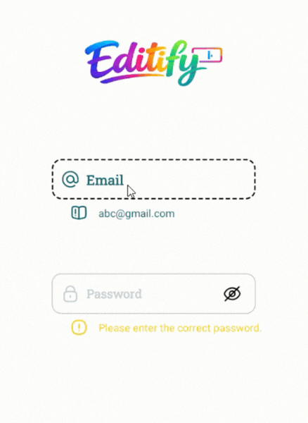
A beautiful and lightweight Material-style EditText library with smooth floating hint animation.
A beautiful, fully customizable, animated Android input field library with floating hint, password toggle, helper/warning/error messages, RTL support, and smooth animations.
Editify provides a modern CustomInputEdit component that replaces the default EditText with advanced UX features commonly seen in premium apps.
- Floating hint animation with scale and color transition
- Password visibility toggle (show/hide with custom icons)
- Helper, Warning & Error states with optional icons and colors
- Full RTL support (
rightDirectionattribute) - Highly customizable colors, fonts, sizes, backgrounds, and icons
- Smooth animations using Android's
ObjectAnimatorandValueAnimator - Works with both Kotlin and Java projects
- Zero dependencies – pure AndroidX + ConstraintLayout
- JitPack ready for instant integration
In your root settings.gradle (or settings.gradle.kts):
dependencyResolutionManagement {
    repositoriesMode.set(RepositoriesMode.FAIL_ON_PROJECT_REPOS)
    repositories {
        mavenCentral()
        maven { url 'https://jitpack.io' }
    }
}dependencies {
implementation 'com.github.Melikash98:Editify:v1.5.1'
}<com.melikash98.editify.CustomInputEdit
android:id="@+id/myCustomInput"
android:layout_width="match_parent"
android:layout_height="wrap_content"
<!-- Hint configuration -->
app:hintText="Username" <!-- Main hint text -->
app:hintIcon="@drawable/ic_user" <!-- Icon inside hint -->
app:hintColor="@color/gray" <!-- Default hint color -->
app:hintActiveColor="@color/green" <!-- Color when focused/active -->
app:hintBackgroundColor="@color/white" <!-- Background of the floating hint -->
<!-- Input text styling -->
app:inputColor="@color/black" <!-- Text color inside the input field -->
app:textColor="@color/black" <!-- Fallback text color -->
<!-- Font & Size Configuration -->
app:hintFamily="@font/vazirmatn_medium" <!-- Hint font (supports @font/ or font family name) -->
app:hintSize="16sp" <!-- Hint text size -->
app:inputFamily="@font/vazirmatn" <!-- Input field font -->
app:inputSize="17sp" <!-- Input text size -->
app:helperFamily="@font/vazirmatn_light" <!-- Helper/Warning/Error font -->
app:helperSize="13.5sp" <!-- Helper/Warning/Error text size -->
<!-- Background states -->
app:activeBackground="@drawable/input_active" <!-- Background when focused -->
app:inactiveBackground="@drawable/input_inactive" <!-- Default background -->
<!-- Helper / Warning / Error messages -->
app:helperText="Enter your username" <!-- Helper message -->
app:warningText="Please check your input" <!-- Warning message -->
app:errorText="This field is required" <!-- Error message -->
<!-- Password toggle icons -->
app:passShow="@drawable/ic_show" <!-- Icon when password is visible -->
app:passHide="@drawable/ic_hide" <!-- Icon when password is hidden -->
<!-- Layout direction -->
app:rightDirection="false" <!-- Set true for RTL languages -->
<!-- Input Type (especially for passwords) -->
<!-- app:inputType="129" --> <!-- Text Password (hidden) -->
<!-- app:inputType="18" --> <!-- Number Password -->
<!-- app:inputType="1" --> <!-- Normal text (default) -->
/>// Get reference to the custom input view
CustomInputEdit input = findViewById(R.id.myCustomInput);
// Get current text value (trimmed)
String text = input.getText();
// Set text programmatically
input.setText("Hello");
// Show helper message (green state)
input.setHelperText("Helper message");
// Show warning message (yellow state)
input.setWarningText("Warning message");
// Show error message (red state)
input.setErrorText("Error message");| Attribute | Description |
|---|---|
| hintText | Hint text |
| input | Default input text |
| helperText | Helper message |
| warningText | Warning message |
| errorText | Error message |
| hintIcon | Icon shown inside the hint |
| passShow | Show password icon |
| passHide | Hide password icon |
| helperIcon | Helper icon |
| warningIcon | Warning icon |
| errorIcon | Error icon |
| activeBackground | Background when the field is focused/active |
| inactiveBackground | Default (inactive) background |
| hintColor | Default hint color |
| hintActiveColor | Hint color when focused |
| inputColor | Color of text inside the input field |
| helperColor | Helper text and icon color |
| warningColor | Warning text and icon color |
| errorColor | Error text and icon color |
| inputType | Input type (especially useful for passwords) |
| rightDirection | Enable RTL layout (true/false) |
| hintFamily | Font family for hint (@font/ resource or font name) |
| hintSize | Text size for hint |
| inputFamily | Font family for input field |
| inputSize | Text size for input field |
| helperFamily | Font family for helper/warning/error texts |
| helperSize | Text size for helper/warning/error texts |
app:inputType="1"      <!-- Normal Text -->
app:inputType="129"    <!-- Password (Text) -->
app:inputType="18"     <!-- Password (Number) -->
app:inputType="145" <!-- Visible Password -->app:rightDirection="true"This project is licensed under the MIT License.
android custom edittext, floating hint edittext, material input field android, password toggle edittext, android ui library, custom input view
Melikash98